Harlequin
Reimagining a romance icon
Harlequin is one of the world’s best-known romance publishers. Established in the Nordic market in 1979, the brand has introduced generations of Swedish readers to romance, passion and escapism. Today, more than 1,000 Harlequin titles are published annually across the Nordic countries.
To modernise Harlequin’s expression in Sweden, we were asked to redesign the iconic diamond and refine the brand’s visual identity.
A new symbol for romance
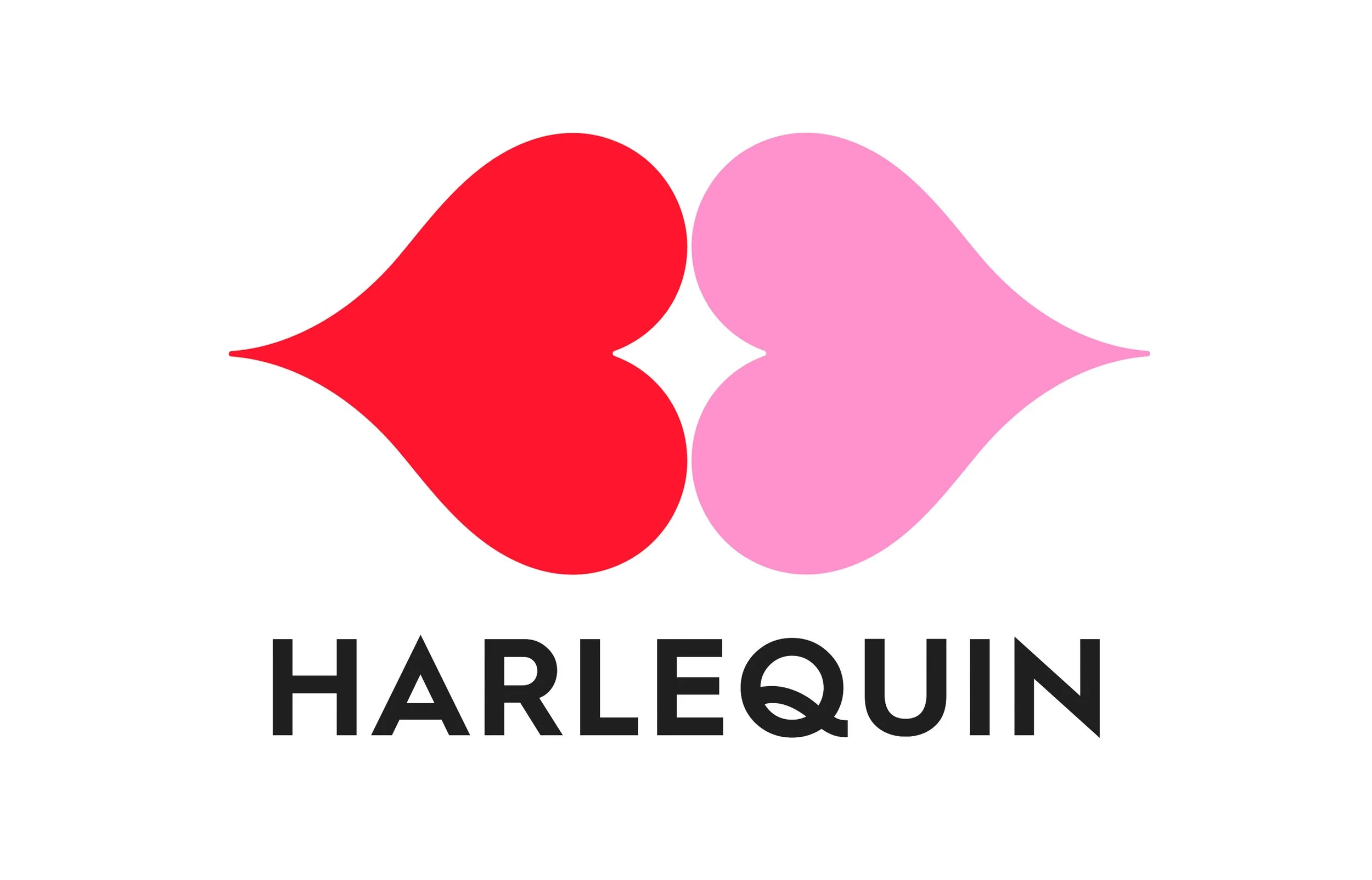
We created a softer, more sensual symbol inspired by the negative space formed when two lips meet. The same shape was used to construct a heart – connecting the identity to intimacy, desire and the emotional world of Harlequin.
The new identity introduced a more contemporary and playful expression while retaining the instant recognition of the original brand.
A flexible visual identity
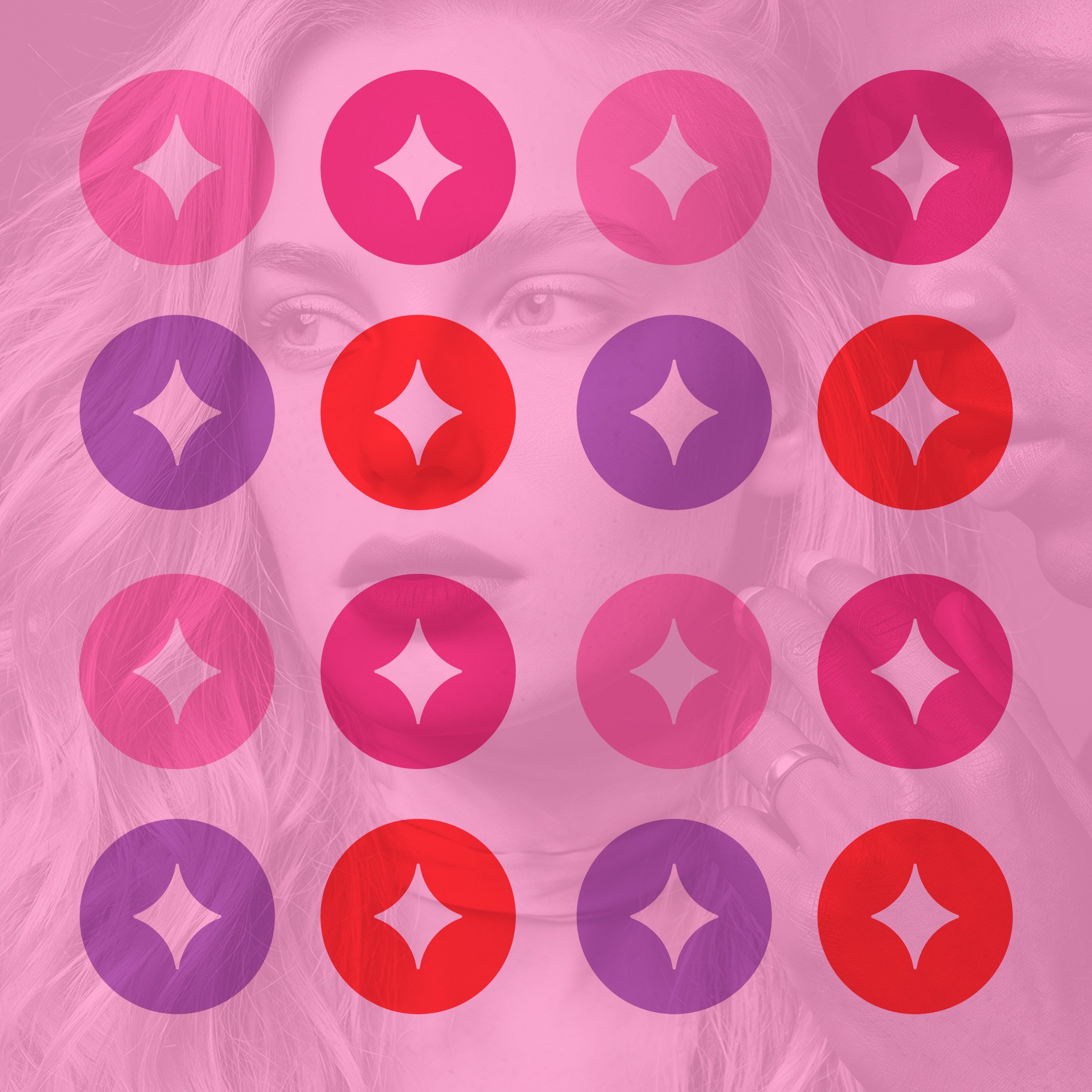
The identity was developed into a cohesive system across Harlequin’s different book series, with colour, typography and imagery giving each genre its own character while keeping the overall brand recognisable.
We also developed guidelines for book covers and social media, creating a consistent visual language across both print and digital channels.
Client: Harlequin Sweden
Deliverables: Brand refresh, visual identity, symbol design, book cover system, social media guidelines, brand guidelines